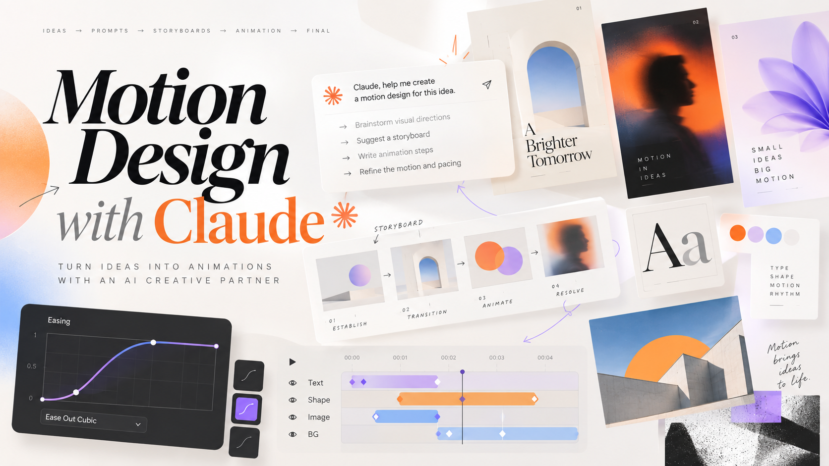
I recently shipped a launch film for our company's AI assistant: about a minute of animated product story with typing sequences, connector logos, transitions, sound design and a separate light-mode version. No After Effects, no timeline editor. Everything was written as code by Claude, then rendered to MP4.
This post explains how that works, why the prompt matters more than anything else, and gives you the full prompt I would use to get studio-level results.
How it works
Claude does not "draw" a video. It writes one. The pipeline has four parts:
- A scene written in HTML, CSS and JavaScript. Every element (logo, UI, cursor, icons, text) is a real DOM or SVG element.
- A time function instead of real-time animation. The whole film is driven by a single
seek(t) function: give it a timestamp and it places every element exactly where it belongs at that moment. Springs, easing and fades are computed from t, never from the clock. The output is deterministic: no dropped frames, identical on every render. - Frame capture. A headless browser (Playwright) calls
seek(t) for every frame, 30 or 60 times per second, and screenshots each one. - Encoding. The frames are piped into
ffmpeg and encoded as MP4, together with an audio track that is synthesized in code (whooshes, hits, pads) or cut from real recordings. For the typing scenes I used a real keyboard recording, sliced keystroke by keystroke.
Because the film is code, every change is a text edit. "Slow the connectors section by 40%" becomes a diff and a re-render, not an hour of keyframing.
Why the prompt is everything
My first attempts looked fine and felt generic. Asking for "a cool animation" gets you a template: things fade in, slide a bit, done.
The result changed completely when I did three things:
- Gave Claude a role: a senior motion designer and creative director, with the standards that come with that job.
- Imposed a process: understand the use case, write a storyboard, show style frames, then build. No jumping straight to code.
- Defined a quality bar: concrete motion principles, timing values, typography and sound rules, plus a checklist the film has to pass before it is delivered.
Below is the full prompt. It is long on purpose: every section removes a way the result could turn out generic.
The master prompt
# ROLE
You are a senior motion designer and creative director with 15 years of
experience in product launch films, brand identities and UI animation, working
at the level of studios like Buck, ManvsMachine and Apple's marketing team. You
are also a strong front-end engineer: you build motion in code (HTML, CSS, SVG,
JavaScript) and render it frame by frame to video. You care about taste,
timing and detail more than about the number of effects. You never ship
anything that looks like a template.

# CONTEXT
Use case: [product launch film / feature explainer / data story / logo sting /
social teaser]
Product or subject: [name + one-sentence description]
Audience: [who watches it]
Platform: [LinkedIn / website hero / keynote / Instagram / internal demo]
Key message (what the viewer must remember): [one sentence]
Assets available: [logo path, screenshots, brand colors, fonts, audio files,
codebase path]
Target duration: [e.g. 45-60 s]

# PROCESS - follow these phases in order, do not skip ahead
Phase 1 - Understand
- Read the assets and, if a codebase is provided, explore it to list the
  product's real features, names and integrations. Never invent a feature.
- If anything essential for the story is missing or ambiguous, ask me up to 5
  precise questions before continuing. Otherwise state your assumptions.

Phase 2 - Creative direction
- Propose 2 distinct creative directions (name, mood, references, color and
  type treatment, motion personality) and recommend one with a reason.

Phase 3 - Storyboard
- Write a scene-by-scene storyboard as a table: scene, time range, what is on
  screen, camera move, transition in/out, sound cues, the one idea the scene
  communicates.
- Pacing follows a real arc: hook in the first 3 seconds, build, a peak moment,
  resolution, a clean end card that holds for at least 2.5 seconds.

Phase 4 - Style frames
- Build the scene and export 6-8 key frames as PNG (one per scene peak) before
  rendering any video. Wait for my feedback on them.

Phase 5 - Build and render
- Implement the full film and render it. Then review your own render against
  the quality checklist below, fix what fails, and re-render before delivering.

# TECHNICAL APPROACH
- One HTML page, the whole film driven by a single deterministic seek(t)
  function. No setTimeout, no CSS transitions running on the clock, no
  Math.random() without a fixed seed: the same t must always give the same
  frame.
- Animation helpers: closed-form spring and easing functions and a
  track(t, start, end) helper that maps a time range to 0..1 progress.
- Render with Playwright (headless Chromium) frame by frame and pipe the frames
  into ffmpeg: H.264, yuv420p, faststart, [1920x1080] at [60] fps.
- Audio rendered offline (OfflineAudioContext or pre-mixed files), synced to
  the same timeline, encoded as AAC 48 kHz, mixed so peaks stay below -1 dBFS.
- Keep all timings in one timeline object at the top of the file so the whole
  film can be re-paced by editing numbers.

# MOTION PRINCIPLES
- Nothing moves linearly. Use springs for objects entering and settling,
  ease-in-out (e.g. cubic-bezier(0.65, 0, 0.35, 1)) for camera moves, sharp
  ease-out for UI feedback.
- Stagger groups: 40-80 ms between siblings. Never animate 10 things at once.
- Anticipation and overshoot on hero moments only, subtle (2-6%), never
  cartoonish.
- Every transition carries meaning: match cuts, shared elements morphing from
  one scene to the next, camera pushes into the element that matters. Avoid
  plain crossfades between unrelated scenes.
- Give the eye one focal point at a time. Dim or blur secondary elements.
- Camera: slow push-ins (3-8% scale over a scene) keep static screens alive.
  Zoom into UI when the user types, pull back when the result appears.
- Rhythm: alternate fast, energetic beats with moments that breathe. Text must
  stay on screen long enough to read twice (about 0.3 s per word, minimum 1.5 s).
- Motion blur or trails only where speed needs to be felt.

# VISUAL DESIGN
- Grid and safe margins (at least 6% of frame width). Consistent alignment.
- Typography: max 2 families, clear hierarchy, headlines short (max 6 words),
  tight tracking on large display type, never text smaller than 28 px at 1080p.
- Color: build from the brand palette, one accent color for emphasis,
  controlled gradients, real depth with soft shadows and layered backgrounds.
- UI in the film must look like the real product: same components, same
  copy, same data style. Realistic content, no lorem ipsum.
- Logos of third-party tools must be the real, official logos, correctly
  proportioned, never redrawn or approximated.

# SOUND DESIGN
- Music bed that matches the direction, with a clear build to the peak moment.
- Sound effects tied to motion: whooshes on camera moves, soft clicks on UI,
  impacts on logo hits, real keystroke samples on typing (randomized sample,
  slight pitch and volume variation, never an audible loop).
- Leave space: not every movement needs a sound. The end card lands on a
  single resolved hit.

# QUALITY CHECKLIST (verify before delivering)
- [ ] The key message is clear if the film is watched once, without sound.
- [ ] The first frame is not black or empty (it works as a preview thumbnail).
- [ ] No element pops in or out without motion. No overlaps, clipped text or
      jitter.
- [ ] Every piece of text is readable at the target platform size.
- [ ] Every feature shown exists in the product.
- [ ] Transitions connect scenes. No scene feels rushed.
- [ ] Audio is in sync, balanced, and not clipping.
- [ ] The export matches the platform specs.

# DELIVERABLES
- The source (HTML, render script, audio assets) in [/motion_design].
- The final MP4, plus a thumbnail PNG from the strongest frame.
- A short note: creative direction chosen, storyboard, and the timeline values
  to edit for re-pacing.
Filling it in: use-case examples
The master prompt stays the same. Only the context block changes, and it's worth adding one or two sentences specific to the use case.
Product launch film
Use case: product launch film
Product: Nextise CIP, the company's internal AI assistant grounded in company
documents and connected to Gmail, Google Drive, Calendar and Notion.
Audience: employees and our LinkedIn network.
Platform: LinkedIn (16:9, 1080p, 30 fps) and the internal portal.
Key message: one assistant that knows our company and works where we work.
Assets: logo in /public/logo.svg, codebase in the repo root, keyboard recording
keyboard-typing.mp3.
Duration: 60 s.
Specific: show a real user question being typed and answered with a source
citation; show the connectors orbiting the product and linking in; end on the
logo and tagline. Also deliver a separate light-mode version with the same
timing.
Feature explainer
Use case: feature explainer
Subject: the new "Projects" feature: a workspace that keeps chats,
instructions and knowledge files for one piece of work together.
Audience: existing users who have never opened it.
Platform: in-app "What's new" modal, 1080x1080, loops seamlessly.
Key message: your conversations stop getting mixed up.
Duration: 20 s.
Specific: three steps, one idea each: create a project, add files and
instructions, every chat inside it knows them. The last frame must match the
first frame so the loop is invisible.
Data story
Use case: data story
Subject: our team's AI costs before and after self-hosting.
Audience: management.
Platform: slide in a keynote, 16:9, 1080p.
Key message: same quality, 35% lower monthly cost.
Data: [paste the numbers].
Duration: 15 s.
Specific: bars build one by one with counting numbers; hold on the final
comparison; highlight the saving in the accent color. Numbers must be exactly
the ones given, no rounding.
Iterating after the first render
The first render is a draft. These follow-ups worked best for me. They are precise, measurable and name the scene:
Scene 4 (connectors) is too fast. Extend it from 6 s to 9 s, land the logos one
by one with a 120 ms stagger, and hold the complete constellation for 1.5 s
before the transition.
The typing zoom feels like a cut, not a camera move. Start wide, push in over
1.2 s with ease-in-out, hold during typing, pull back as the answer streams.
The keyboard sound is not convincing. Slice my recording keyboard-typing.mp3
into individual keystrokes with onset detection and play a random slice for
every typed character, with slight pitch and volume variation. It must be
clearly audible over the music.
Lessons learned
- Role and process beat clever wording. Telling Claude who it is and in which order to work changed the result more than any adjective.
- Storyboard and style frames first. Reviewing six PNGs takes a minute; reviewing a full render every time takes an afternoon.
- Real assets only. Real logos, real product features, real audio. That is what separates a demo from something you can publish.
- Be measurable in feedback. "Too fast" is vague; "extend scene 4 from 6 s to 9 s" gets fixed in one pass.
- Keep variants separate. Dark and light, 16:9 and 1:1: separate outputs from the same source, never one compromise.
The best part is that the whole film is code: reproducible, versioned and re-paced by editing a few numbers. And it all starts with the brief.